Encompassing.
Visually appealing yet easy to follow, The Nest encompasses a wide range of topics, experimenting with design and writing styles to engage thought-provoking responders exploring culture, science, and technology.
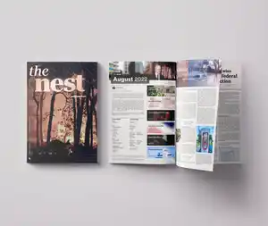
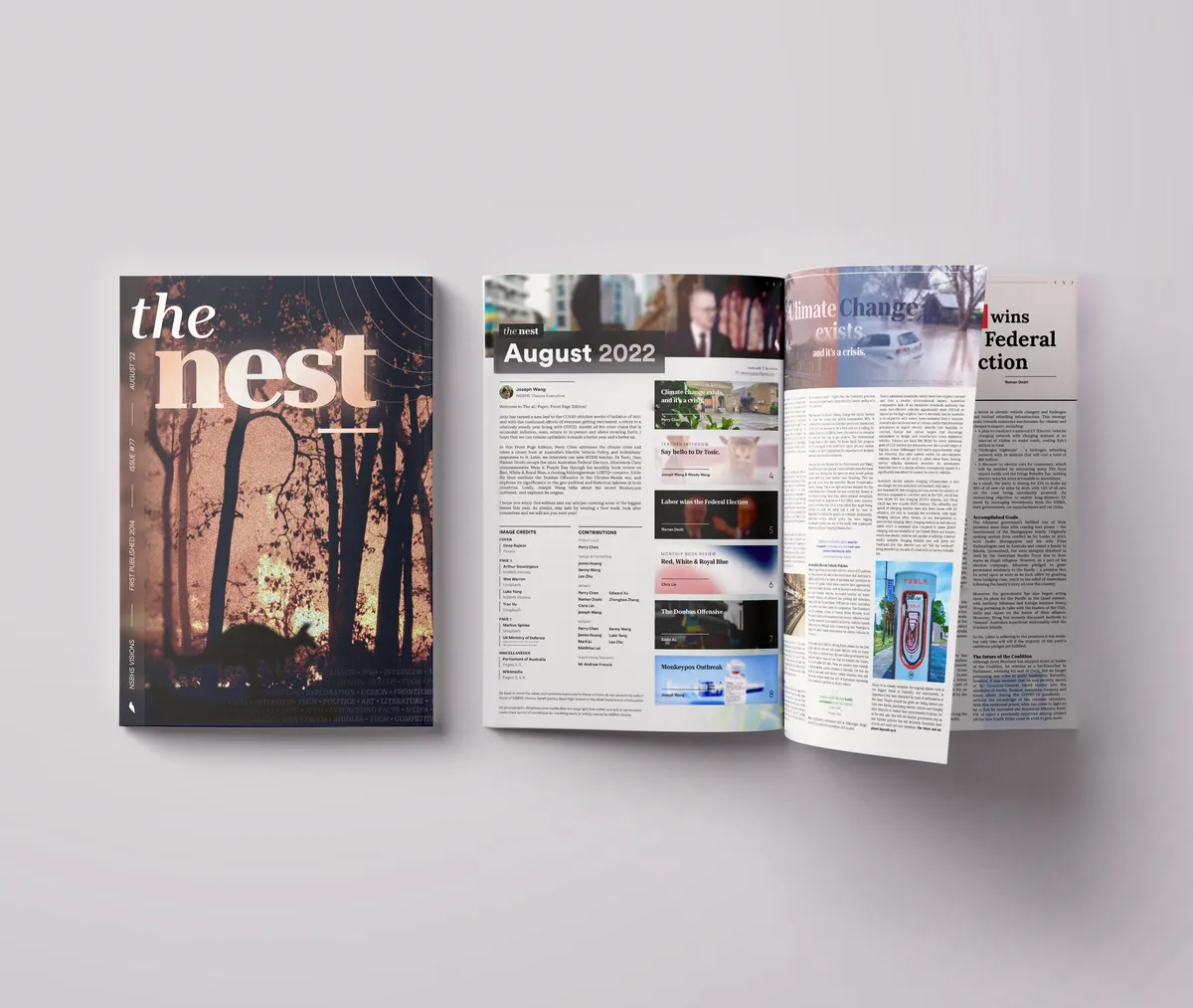
The Nest is a newspaper design that blends articles of various topics from politics, to the environment, to interviews into a cohesive, eight-page layout, while ensuring each article maintains a distinct personality.
The project was made for the nationwide ATOM FrontPage competition held by the Australian Teachers of Media, where schools would submit a newspaper or magazine design. Leading the design process of this project, this submission resulted in one of the five finalists from 2022.
Snapshots
View full PDF
Design Discussion
The front cover of the design features a digitally altered image depicting a bushfire with a hint of a kangaroo in front of it. This reflects the context of the Australian bushfires happening at that time, which was further expanded upon in the editorial and articles. The front also includes the title “The Nest”, a sidebar including the issue number, issue month and representation of Visions; the team that created this magazine which I was a part of. The bottom right features a faded repeated text of the topics covered in the magazine; politics, art, literature, etc.
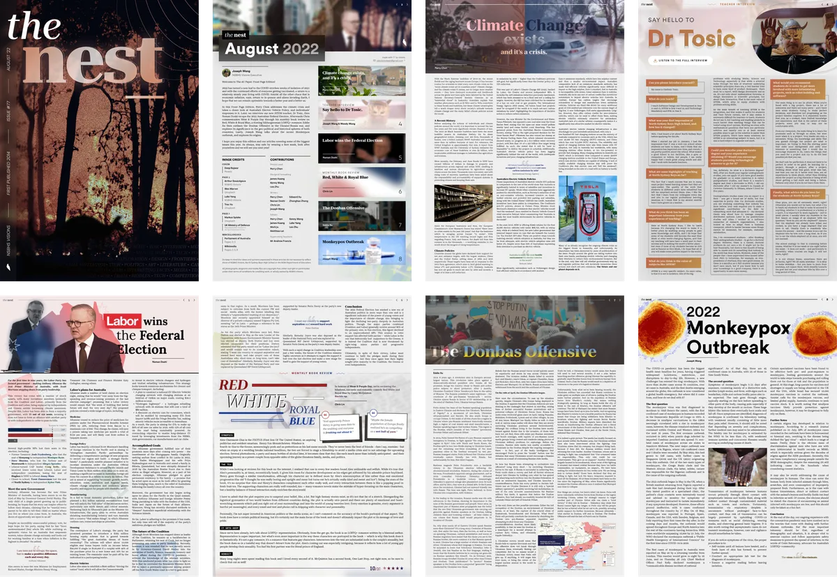
The first page compactly features a collage of elements from each article at the top, the editorial, the contents on the right with a background image related to each article, and credits.
Each article was dynamically designed specific to its context. For instance, the teacher interview featured questions and answers in boxes overlayed in each other, with a consistent golden colour theme that matched the iconic theme the interviewee was known to wear. The book review article was put above a grainy, slightly rotated box that simulated the look of paper. The election article had hints of the voting ballots in the background, with different colours representing the major political parties represented.
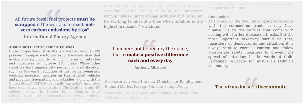
There were some consistencies kept to ensure it remained coherent, however. These included the header with some branding and a page number, the body text font (Roboto Serif), and the design of the emphasised quotes:
...
This project took a significant amount of time and effort, especially being challenging as it was a medium I didn’t usually work with; newspaper and magazine design.
However, I adapted and the team made sure the editing and formatting was up to a high standard, and therefore, I am proud of the accomplishment that is this project, which ended up received a finalist position in the FrontPage 2022 competition.