


Elegant.
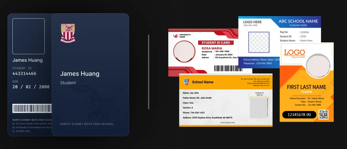
Personal card designs, from business cards to ID cards had a similar design that felt cluttered, as though all information had to be tightly packed into a single palm sized piece of plastic, and without much character or attention to detail.
I sought out to challenge this convention - to create a card that was able to convey important information with clarity and distinction, while being elegant and minimal, and representative of the values the institution (the school, in this case) holds.
Hence, this card design is personal, unique, and sophisticated, allowing essential information to stand out in a cohesive and visually pleasing manner.
This card was issued to all ~900 students within the school upon the completion of the design.
Identifying the Issues
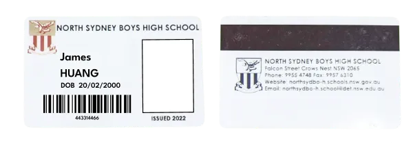
Looking at the original design of the Student ID card, several issues were found.
Here is a summary of the primary flaws:
Lack of character
The card is generic looking. lacking elements that distinctly represent the school aside from the inclusion of the school crest.Lack of clarity
The front of the card lacks negative space, with each element similarly sized without clearly hierarchy, making it difficult to focus our attention on a specific area.Incorrect and inconsistent alignment
The internal elements of the card lack consistent alignment, creating a visual discord that hinders a seamless flow of information. This misalignment poses a challenge in guiding the viewer effectively and complicates the overall design.
These issues guided the focus when redesigning this card.
The Colour Palette
To make the card as iconic and recognisable as possible, the lack of character and personality in the card was addressed through incorporating the school’s iconic colours, exhibiting a sense of belonging to the school.
The school’s signature hues were a burgundy red, a gold, and a dark blue.

It was found that using a dark blue as the background enabled the other colours within the school logo to be emphasised, instead of receding. This visual contrast helped draw the attention towards the school crest, reinforcing the incorporation of the school identity within the card design.
Design Discussion
The objective of this card was to be pleasing to look at, with information efficiently packed with clarity, and to convey the institution’s (the school) identity, and several design decisions were made accordingly..
It was also decided that the card would be portrait, which has many benefits. It’s unique - reinforcing the recognisability of the card. It’s also more functional for quick identification of details due to the natural top-to-bottom eye movement. The information on the card is also generally short and doesn’t require the line length of a horizontal card. The portrait orientation also accommodates the student's photograph and personal details in a clear, organised manner.
Inter is the primary typeface used in this design, as it has a modern and clean design while being easy to read. It is complemented by Fira Code which is used for the numeric elements.
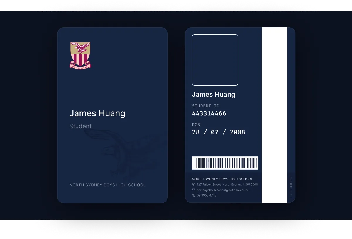
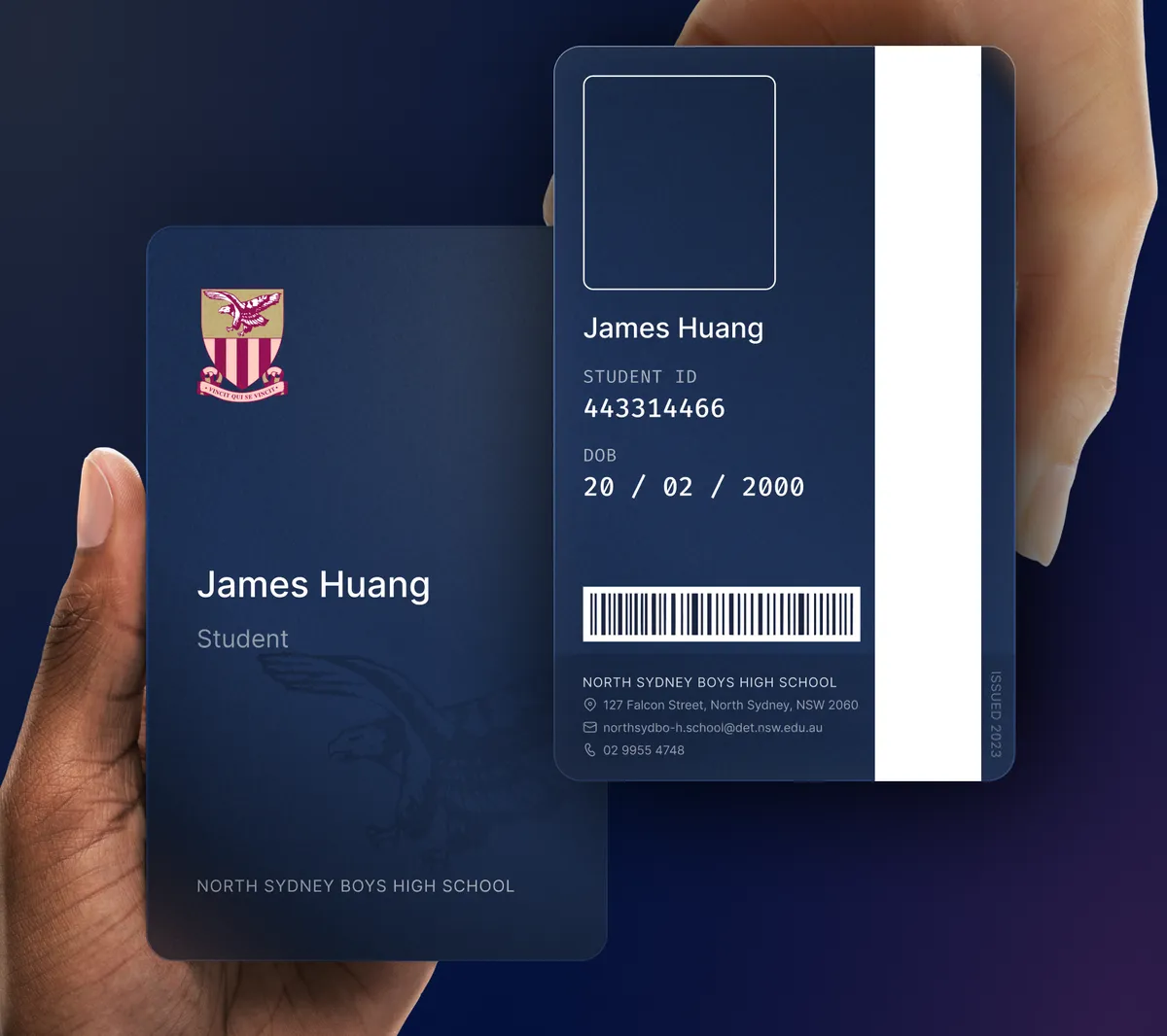
The Front
Most card designs forget that there are two sides of the card, with one side being dysfunctional (usually just showing the terms of conditions or the organisation's contact details) while the other side having all the relevant information.
Hence, we designed this card so that the front would include the essential identifiers - the school, your name and your status as a student in a minimal and aesthetic form.
This side could be shown to prove your status as a student to the school, without exposing personal information. It’s also perfect for display due to the minimal design, making it perfect to wear with a card holder around their neck.

To further establish identity, the school’s iconic falcon mascot is subtly imprinted in the bottom left of the card, along with the school’s full name, as shown above.
The Back
The back would have all the relevant information to a student, including a photo, the ID number, date of birth, a barcode, as well as the cards issue date, and the school’s contact details.
To ensure clarity, a sense of hierarchy was established and elements were evenly spread out. The photo, name, and student information are presented upfront prominently, while contact details, barcode, and issue year recede at the bottom above a slightly darkened background.
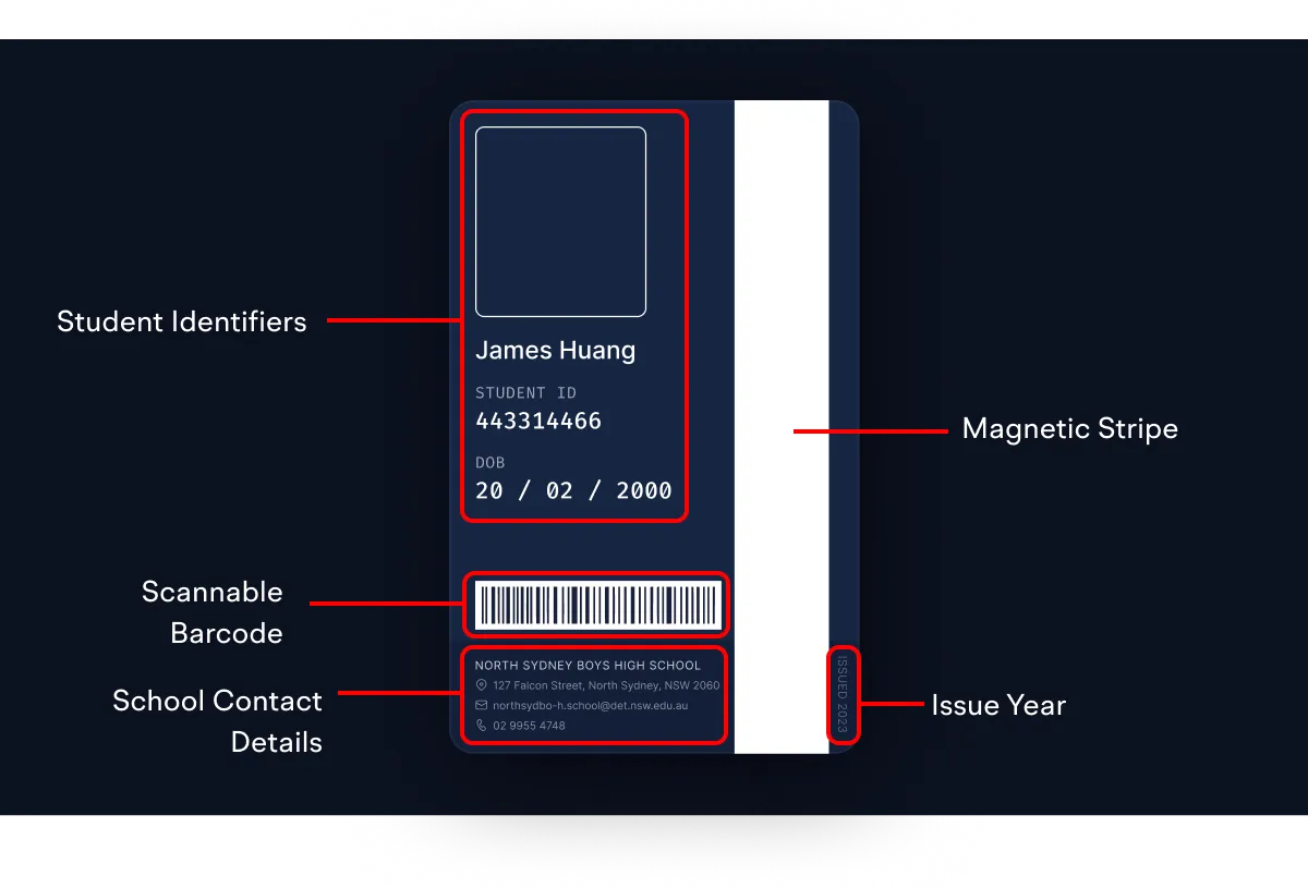
Numerical elements like ID number and DOB are rendered in Fira Code for enhanced legibility and clarity. The contact details section features a slightly darkened backdrop and transparent text, creating a visual distinction from other information on the card.
The issue year is seamlessly concealed to the right of the magnetic stripe.
Variations
To ensure all students are encompassed, a few variations had to be made to accomodate students of varying name lengths.
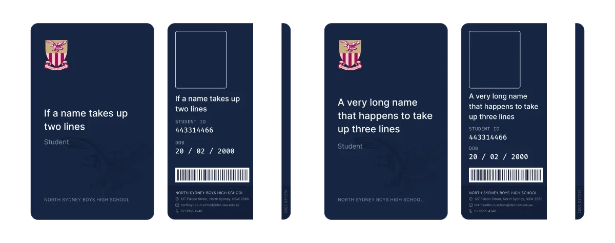
In the rare case that a student had a name that took up more than three lines, the text size would be adjusted specifically for their case to fit their name.
...
Ultimately, the significant level of attention to detail that has gone into this project has enabled it to, in my eyes, redefine the way ID cards should look - sleek, elegant, clear. The design is minimal and aesthetic, yet conveys all the necessary information with clarity. Overall, I am proud of this design and what it has achieved.
Return to all my projects