


Inviting.
Nearly all logos share the same job: to be timeless, memorable and recognisable instantly, while clearly symbolising the essence of the brand, and evoking a sense of identity and trust.
I designed a logo for a school’s business society, meticulously crafted to represent the society and evoke an inviting and welcoming tone with an emboldened, elegant logo.
Identifying the Issues
The first step in the successful redesign is to identify the existing issues within the previous design.

Within the previous logo:
The logo is fairly detailed, and has several intricacies that may make it difficult to recognise from a distance.
There isn’t an element in the logo that is immediately symbolic of the business-focused aspect of the society.
The colour was a dark, deep red that was nearly brown, that failed to make the society feel as approachable and welcoming as was wanted.
The italicised serif typeface was also unsuitable as it introduced a sense of formality that didn't align with the desired approachable and dynamic impression intended for a business-focused society's logo.
The Colour Palette
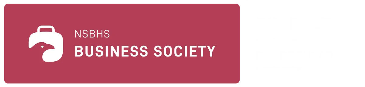
The society had already integrated the color red as a distinctive and memorable part of its identity. Hence, red was the primary colour used in this design. The previous red used, however, was barely saturated and lacked the visual impact needed for an approachable feeling and a dynamic character.
With this in mind, the colour red remained, but was made significantly lighter and more saturated, giving it a unique, welcoming and recognisable look.

Typography
The choice of typeface family for the accompanying text was DIN, as it compliments the minimal design while having a professional and modern identity, and the entire logo is written in uppercase.
Design Discussion
As identified previously, the logo had several issues - having too many intricacies, lack of a “business” representation, and a need for a more welcoming feel.
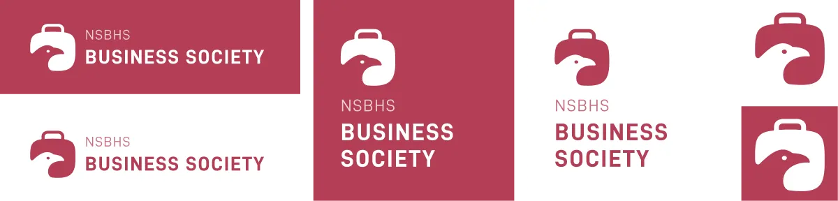
Thus, the elements for the logo was decided. First, there is the falcon, which was the entirety of the previous logo, and an essential element representative of the school in which the society.
Next, an element that would make the logo immediately recognisable as a “business” society was required. Universally, suitcases are synonymous with business, and it was therefore decided as a symbol to include in the logo.

These two elements would harmoniously merge into a single piece.

The logo had to be significantly more minimal, to minimise visual clutter to allow each of the key elements to stand out prominently. The falcon could be reduced its most recognisable part - its head. The suitcase was already a fairly simple design, requiring a box and a handle.
To merge them, the falcon is subtracted from the corner of the suitcase, taking up a significant enough space for both elements to be recognisable.
To reinforce our approach in making the logo warmer and more welcoming, along with the use of a softer red, the logo features strong curvatures that creates a sense of elegance and friendliness.

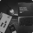
The branding was applied throughout consistently. For instance, here is a presentation slide template used:

...
After the new logo rolled out, the society saw a significant rise of around 30% in popularity due to the many reforms that were made within the club, including the renewed branding that I worked on.
In summary, this logo redesign achieved the ideals of a logo - a friendly, recognisable design that encapsulates the society's mission.
Return to all my projects